The favicon of my website currently is:
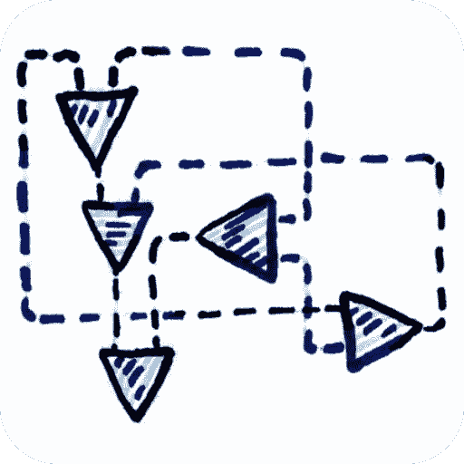
This represents an interaction combinator tree, that can be interpreted as a lambda calculus expression.
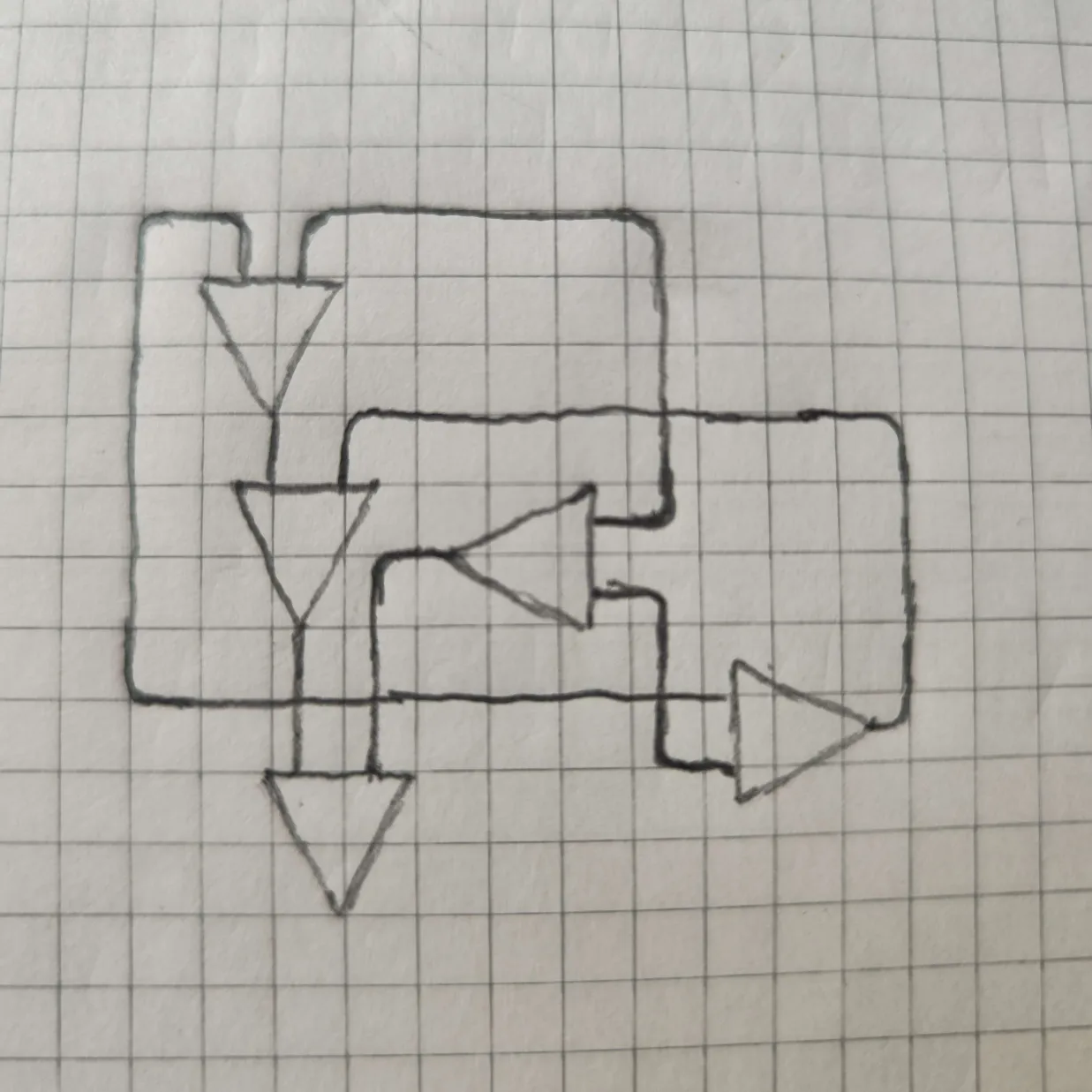
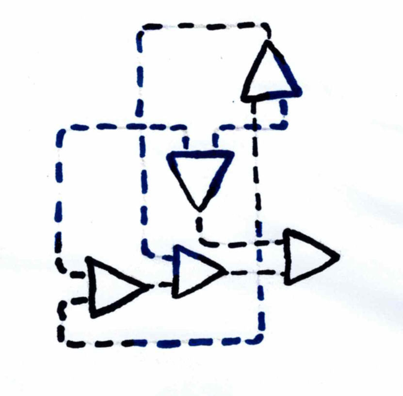
Step 0: Designing the Circuit
I ended up with this:
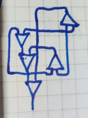
(this is the second attempt at layouting the circuit)
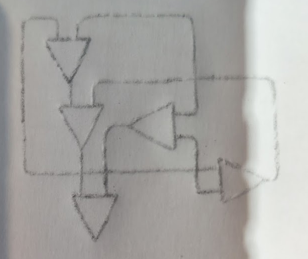
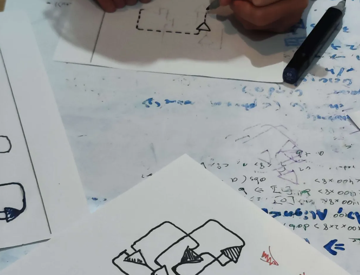
Step 1: Sketching
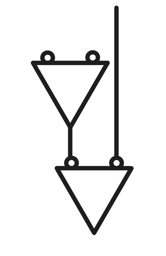
While starting doing this, I realised that one wire always overlaps with one node triangle, unless I cheated. Here is a visual representation of this (inaccurate):
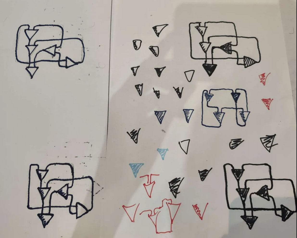
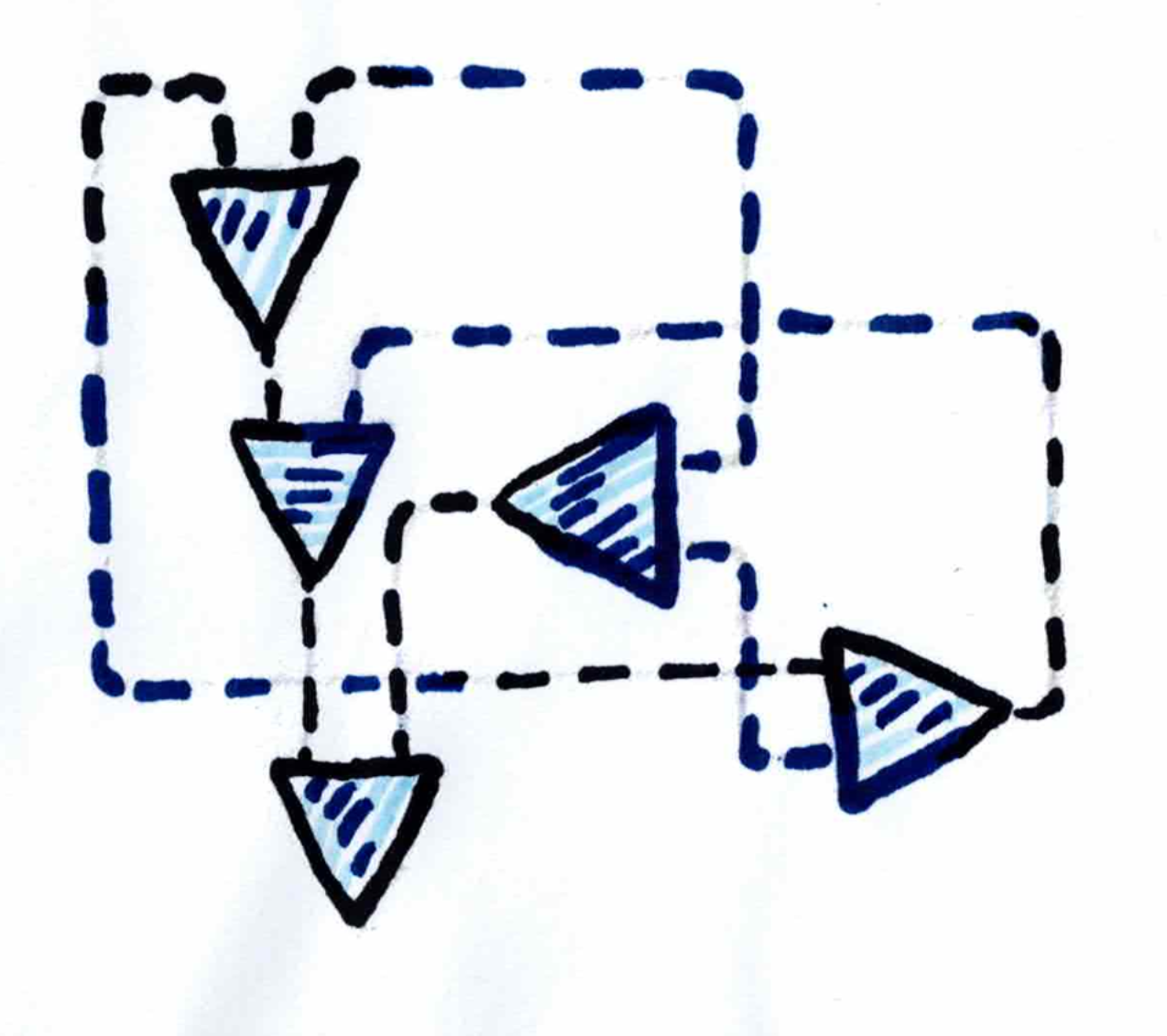
This means that I have to modify the layouting from step 0 a bit, which is unfortunate, but in retrospect, I think that it makes the result look better:
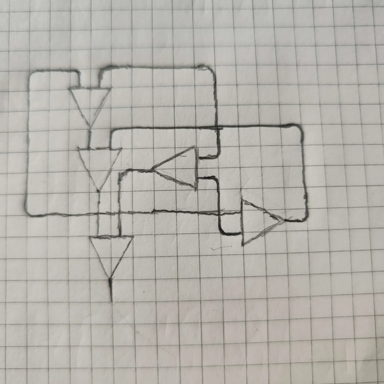
That however takes up too much space, so I did another variation:
I also did another variation here, but decided to not use that.
Step 2: Preparation for coloring
I colored the back side of the piece of paper which contains the sketeches with a pencil, put a white piece of paper behind it, and then re-traced the line, to get a lighter version of the sketch onto the white paper.
Then I used modern technology (a copier) to copy that piece of paper multiple times, and also scale it up (to allow for more details).
Step 3: Coloring
It was a disaster…
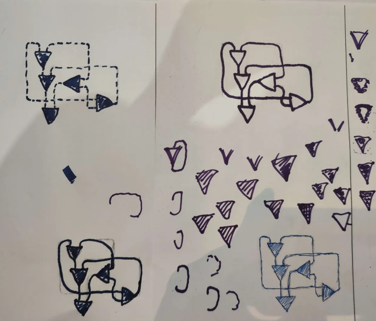
Some variants actually look nice, but only parts of it.
Step 4: Outsourcing the coloring
After some time, I just gave up, and decided to ask my sister for help…
I only told her (translated):
Can you please color this?
It's supposed to be a circuit, and it will be a small logo for a website.
The website is mainly black and white, but this (context: persian blue) blue would work too.
And less than half a minute later, she came up with this:
We considered that the logo will end up being quite small, so "we" wanted it to look good when zoomed out. This is a pretty nice idea, because the different colored wires end up blending together nicely.
I put that into the scanner, and meanwhile she experimented with different filling styles.
Then she came up with this (the final version):
Filling the drawing only took her about 20 seconds!
Step 5: Digital Modifications
As last step, I removed some of the sketch lines and some minor imperfections digitally.Conclusion
I like the final result a lot (as small logo), but it's a bit too detailed as favicon.
I will re-visit this topic in the future.